This gallery shows the core PaperPlotR workflow: build ordinary
ggplot2 panels, apply publication-style themes and semantic
color scales, compose with panel tags, then export with an explicit
graphics backend.
Semantic Group Mapping
Use scale_fill_groupmap() or
scale_color_groupmap() when group names should keep the
same colors across panels.
summary_df <- data.frame(
  Condition = factor(
    c("Control", "Treatment", "Rescue"),
    levels = c("Control", "Treatment", "Rescue")
  ),
  Mean = c(1.00, 1.42, 1.18),
  SE = c(0.08, 0.11, 0.09)
)
study_colors <- c(Control = "#4D4D4D", Treatment = "#D55E00", Rescue = "#009E73")

p_bar <- ggplot(summary_df, aes(Condition, Mean, fill = Condition)) +
  geom_col(width = 0.54, colour = "white", linewidth = 0.18) +
  geom_errorbar(aes(ymin = Mean - SE, ymax = Mean + SE), width = 0.12) +
  scale_fill_groupmap(values = study_colors, groups = summary_df$Condition) +
  theme_lab() +
  theme(legend.position = "none") +
  labs(x = NULL, y = "Relative signal")

p_bar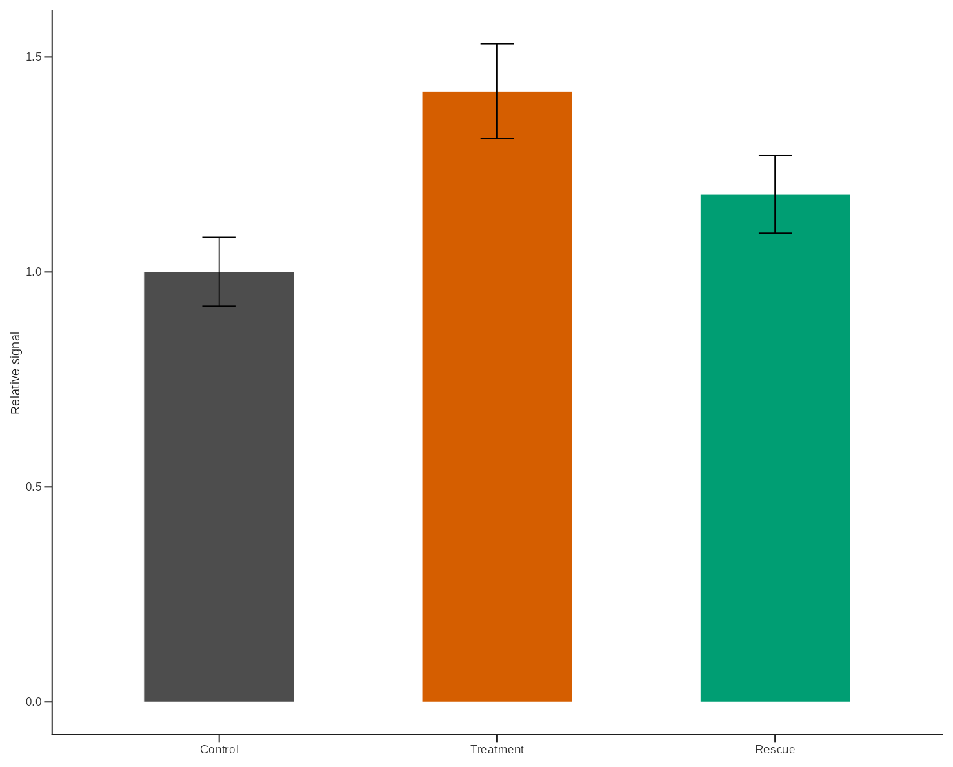
Multi-Panel Layout
The same semantic mapping can be reused across a compact figure layout.
scatter_df <- data.frame(
  Condition = factor(
    rep(c("Control", "Treatment", "Rescue"), each = 5),
    levels = c("Control", "Treatment", "Rescue")
  ),
  PC1 = c(-2.0, -1.7, -1.3, -1.0, -0.7, -0.2, 0.1, 0.3, 0.6, 0.8, 1.1, 1.4, 1.7, 1.9, 2.2),
  PC2 = c(0.8, 0.4, 0.6, 0.1, 0.3, -0.2, 0.1, -0.3, 0.2, -0.1, 0.6, 0.9, 0.5, 1.1, 0.8)
)

p_scatter <- ggplot(scatter_df, aes(PC1, PC2, colour = Condition)) +
  geom_hline(yintercept = 0, linewidth = 0.22, linetype = "dashed", colour = "#BFBFBF") +
  geom_vline(xintercept = 0, linewidth = 0.22, linetype = "dashed", colour = "#BFBFBF") +
  geom_point(size = 1.8, alpha = 0.86) +
  scale_color_groupmap(values = study_colors, groups = scatter_df$Condition) +
  theme_lab() +
  theme(legend.position = "none") +
  labs(x = "PC1", y = "PC2")

heatmap_df <- expand.grid(
  Feature = factor(paste0("F", 1:6), levels = paste0("F", 1:6)),
  Sample = factor(paste0("S", 1:4), levels = rev(paste0("S", 1:4))),
  KEEP.OUT.ATTRS = FALSE
)
heatmap_df$Signal <- c(
  -1.0, -0.6, -0.2, 0.2, 0.6, 1.0,
  -0.7, -0.3, 0.1, 0.5, 0.9, 1.2,
  -1.2, -0.8, -0.4, 0.0, 0.4, 0.8,
  -0.4, 0.0, 0.4, 0.8, 1.1, 1.4
)

p_heatmap <- ggplot(heatmap_df, aes(Feature, Sample, fill = Signal)) +
  geom_tile(colour = "white", linewidth = 0.18) +
  scale_fill_gradientn(colours = lab_gradient_palette(7, palette = "blue_red")) +
  theme_lab() +
  theme(legend.position = "none", axis.ticks = element_blank(), axis.line = element_blank()) +
  labs(x = NULL, y = NULL)

comparison_df <- data.frame(
  Condition = factor(
    rep(c("Control", "Treatment", "Rescue"), each = 10),
    levels = c("Control", "Treatment", "Rescue")
  ),
  Value = c(
    4.2, 4.6, 4.8, 5.0, 4.9, 5.1, 4.7, 5.2, 4.5, 5.0,
    5.3, 5.7, 6.0, 6.1, 5.9, 6.4, 6.2, 5.8, 6.3, 6.1,
    4.9, 5.2, 5.4, 5.5, 5.3, 5.8, 5.7, 5.4, 5.6, 5.5
  )
)

p_compare <- plot_box_paper(
  comparison_df,
  Condition,
  Value,
  dictionary = "default",
  show_signif = FALSE
) +
  theme(legend.position = "none") +
  labs(y = "Value")

combo <- layout_lab(
  p_bar,
  p_scatter,
  p_heatmap,
  p_compare,
  ncol = 2,
  tag_levels = "A",
  tag_size = 9,
  tag_family = "sans"
)

combo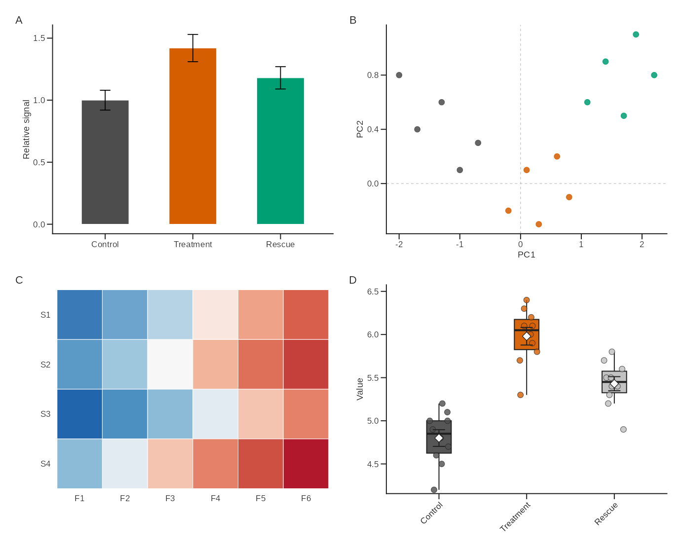
Export
Use explicit devices for reproducible output in production workflows.
save_lab(
  plot = combo,
  filename = "figures/paperplotr_gallery.png",
  spec = "4.9x4.9",
  ncol = 2,
  nrow = 2,
  journal = "nature",
  device = "ragg_png"
)

save_lab_plot(
  plot = combo,
  filename = "figures/paperplotr_gallery.svg",
  preset = "nature",
  device = "svglite"
)
On macOS, device = "quartz_pdf" is available for native
PDF output. Exported files are checked by default so missing or
suspiciously small files fail early.